 Reading Time: 2 minutes read
This blog is an insight to why desktop and mobile should not be considered a single development project. Any project that considers both desktop and mobile should be tailored according to both. We will be looking at some of the reasons why one size doesn’t fit all and why it should not be taken for granted that it does.
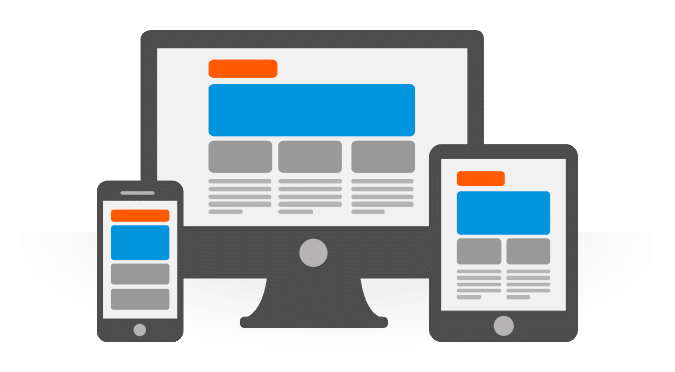
Let’s kick off with screen size, the most obvious of all differences. The average size of a phone screen is one fifth to one tenth the size of monitors (Unless someone has made a 20+ inch phone that I don’t know about). This means that more information must be displayed in less space, at the same time elements that are not the point of attention for the page must less noticeable . An example of this is sites that change the display accordingly. On a large screen they have buttons at the top or left of the page but on a smaller screen it becomes hidden in a slide out menu.
The second on the list is touch input. Touch inputs aren’t as accurate as the good old mouse, to handle this elements should be easily tapable. So instead of putting the word “Back” on a page it makes more sense to have an arrow icon in it’s place. Swapping text to icons as much as possible helps to provide information in limited space along with making it easier to use on a touch device. (Added bonus: if you have sites or apps in multiple languages you don’t need to translate an icon)
Third (this one is not too obvious) is load. By load I mean the system requirements required to run the app or page. I’m a gamer so I have a nice desktop, at the same time I use a Nexus 4 and an HTC sensation as my phone. I very rarely have loading problems on the desktop but on the days I take the HTC out to the same sites I see the phone slow to a crawl. When going for mobile pages keep them as simple as possible, don’t try and run every javascript, ajax and the like on a mobile version, keep it as lite as possible. For apps: unless a mobile version of a game is being made try to keep the requirements really low by considering the worst device you can think of as the target.
That being said, do make a mobile website. With the growth of mobile very few visitors are coming from a desktop. Most are probably coming in from a portable device.


