 Reading Time: 2 minutes read
Businesses today are fully aware of the impact of community insights. As businesses try to outmuscle their competition, communities are growing by the hour and the number of businesses that are using them to conduct research is increasing too.
The global need to maintain and grow communities is ever-increasing. This means community portals must be as user-friendly as possible and easy to use overall. QuestionPro Communities being the leader in online communities platform, we are on the path to provide our community managers with creative solutions so that they can manage and grow their community effortlessly.
Why did we need an update?
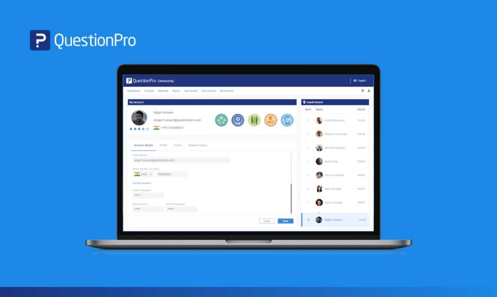
Usability is one of our primary focuses. In our mission to provide you with the best community management tool and platform, we needed to enhance the platform to keep the design neat, and user-friendly. Now, see a lot more in a compact, but a more polished look.
The problem statement:
- The current design has different CTA’s for My Account, My Profile, Badges.
- The current design lacks an intuitive and sleek design.
- More information on reward redemption history is necessary.
- An option to subscribe to different email notifications.
We also had a couple of requests from our customers that we catered to. Members wanted to update their profile and personal details so that they receive relevant survey options and perform other activities in the community. They also wanted to be able to view the rewards earned and redeemed at the same place.
Our solution:
For better usability and user-friendliness, we redesigned the portal UI to merge the tabs.
- My Account
- My Profile
- Badges
- Points History
- Rewards Redemption History (new)
These features are available for all existing Communities license holders.


