 Reading Time: 3 minutes read
What if you wanted to know if a person’s household income will directly influence their decision to purchase a new smartphone. When determining if one data point is strongly associated with other results from a different question, then you run a correlation analysis. This is a bivariate analysis that measures the strength of association between two variables and the direction of the relationship. In terms of the strength of the relationship, the value of the correlation coefficient (rs) varies between+1 and -1. As the correlation coefficient value goes towards 0, the relationship between the two variables will be weaker.
The direction of the relationship is indicated by the sign of the coefficient. A positive + sign to +1 indicates a direct relationship and a negative – sign to -1 indicates an inverse relationship.
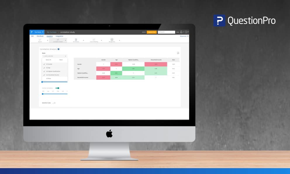
With our latest update to the correlation analysis tool, you can now self-select and generate the correlation output for the required questions of your choosing. Strong correlations will automatically be highlighted based on the strength of the correlation found from the results. This will allow you to differentiate highly correlated cells and inversely correlated cells and provide quick insights.
The setup
Go to: My Surveys » Select Survey » Analytics
Click on Correlation Analysis under the Analysis drop down
Next, select the specific questions to add in the row and columns on the left side. This will allow you to set up different questions and find strong or weaker correlations between them.
Setting thresholds
Once you have selected your row and columns, you can dictate the threshold of strength for the correlation tool to highlight. The lowest is 0.5 and the highest is 0.99. The default is 0.65 but you can move it up or down as you wish. Set the threshold for high and inverse correlation by slides both scales.
Highlighting the results
The positive correlation highlights fall into three buckets:
- Values till 0.8 is highlighted in light green
- 0.8 to 0.9 is highlighted in medium green
- 0.9 and above are highlights in a dark green
The negative correlation highlights fall into three buckets:
- Values till 0.8 is highlighted in light red
- 0.8 to 0.9 is highlighted in medium red
- 0.9 and above are highlights in a dark red
Keep in mind that moving the threshold slider will change the highlighted results.
Output for analysis
In addition to the highlighted online report, you can download an offline excel. To download go to the top right side of the correlation report and click on the xls icon to download the offline report.
Correlation analysis is available for all licensed users with a corporate, team, and enterprise license.
To learn more about correlation analysis or you would like to upgrade your license to have access to this tool, contact our sales team and we’ll be happy to get you started.


