 Reading Time: 3 minutes read
With this being the week of July 4th and Independence Day in the United States, I thought it might be fun to explore the idea of Freedom as it relates to survey reporting.
As I write this, I’m reminded that it was a distinct lack of freedom in survey reporting back in 2005 that led me to QuestionPro in the first place. Yup — I was using SurveyMonkey and paying for it — but the reporting features just didn’t work for me. I was running a regular bi-monthly survey with tens of thousands of responses and I simply couldn’t process the data fast enough. There was just too much manual downloading into Excel, cutting, pasting and messing around with — to the point that I was inserting entirely too much human error into my reporting and I simply couldn’t have that.
More graphics, more pictures, more data, more sleep
I admit it. It’s all about looking good for me. I want to look smart, I want to look prepared, and I’d like to get some sleep in the process. And if you spend as much time as I’ve spent pouring over data, wondering what the best way is to represent the information and then somehow twisting the data sheets to my will — well you understand that this can result in hours and hours in front of a computer.
QuestionPro’s reporting features are what grabbed me back in 2005 because they were way further ahead than any other small business (affordable tools) I’ve looked at (SurveyMonkey and Zoomerang at the time). And QuestionPro has kept on inventing and expanding their reporting features year after year that will literally free you up to enjoy your data — yeah, I’m not kidding!

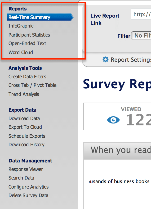
The first thing I want to point out is the very first section under the “Report Tab” that will give you a glance at all your data in a way that will really make you look like a hero:
- The infographic feature — This is a relatively new feature that will free up — what? 20 hours and more than a couple thousand dollars of design time? QuestionPro will automatically take your data and render a gorgeous infographic that you can easily share with bosses, team members and your community.
- Participant statistics — This is an oldie but a goodie. It’s one of the original features that QuestionPro uses that help you track exactly how your survey performs. Think of it as Google Analytics for your survey. You will see exactly which questions cause the most drop outs and give you the information you can use to improve the design of your survey.
- Open Ended Text — I have to admit that I have a love/hate relationship with this feature. I love that it lumps all the open ended text together when I have to code it all — but I hate it when it lumps the open ended texts when it’s disconnected from the multiple choice questions that give it context. Either way — it’s a great feature that I can really get behind.
- Word Cloud — THIS is my second favorite feature next to the infographic. Because I cannot stand tabulating open ended text – but I love how great the word cloud is. It literally tabulates the most common words and it looks great to insert inside your report. Your clients and report readers will love you for it and think you spent hours slaving over the data.
And, stay tuned for a more in-depth look at our brand-spankin’ new real time summary features. Don’t tell them I told you, but just to let you know, you can change themes and colors, and more cool stuff.
What’s your favorite reporting feature?


