 Reading Time: 3 minutes read
Today, we are excited to feature a guest post on our blog. Welcome Timothy Rotolo of TryMyUI, a UI testing company named by Forrester Research as one of six tools to consider for usability testing.
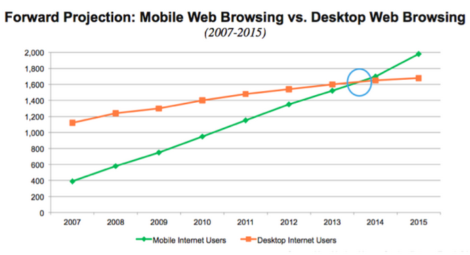
This month, over 1 billion people will use Facebook from a mobile device. Of that billion, 399 million will never see their newsfeed on a computer screen – about 30% of all active Facebook users access the site exclusively through mobile. Mr. Zuckerberg’s ubiquitous social network is not unique in this; last year, for the first time, Americans spent more time on their smartphones than on their computers, and in January 2014, mobile apps surpassed desktop browsing in total share of internet usage.
LEARN ABOUT: User Experience Research

Everywhere, the importance of mobile is growing, and users want to do everything on their mobile devices. The effect is disproportionately strong in online commerce, where mobile has rapidly overtaken desktop as the primary setting for customer interaction. Companies like StubHub have seen a majority of their traffic flock to mobile, where a ticket is now purchased every 6 seconds. 67% of online consumers say they are more likely to buy from a company whose site is optimized for mobile; on the flip side, 30% are liable to abandon a purchase midway through the process if the shopping experience is not mobile-friendly.
That’s why it’s so important that your online presence is carefully designed to cater to the mobile masses. As much as people love to online shop on their phones and tablets these days, rising expectations or shorter attention spans or the proliferation of choices or some other variable or combination of variables has created a finicky mobile market. It is not enough to simply offer online shopping for mobile – consumers want streamlined, user-friendly mobile shopping experiences that look good, feel comfortable, function smoothly, and inspire trust and credibility.
In a 2013 survey by Jumio, two-thirds of mobile consumers reported abandoning a purchase – half of them because the checkout process just took too long or was too difficult. Another quarter said their purchase failed because it didn’t go through, and still more cited concerns for the security of their payment information. Clearly, despite the ever-increasing importance of mobile, most online retailers aren’t doing enough to maximize the opportunities it offers.
Of course, as with everything, there are exceptions. Florist ProFlowers optimized their website for mobile devices and saw a 20-30% increase in their conversion rate. Not only that, they found that having a well-designed mobile presence increases conversions on desktop devices as well. That’s because mobile visitors are much more likely to return to your site on their computer if they are satisfied with their mobile experience, thanks to high rates of device-switching to accomplish tasks online.
So, are you optimizing your online presence for mobile? Think about your mobile website or app as it is today: are you confident that users would be willing to input their credit card information without hesitation? That they would be able to read your content and descriptions without pinching and zooming? That they would feel at ease navigating through your menus, search results, and product pages?
Or would they be part of the 47% that felt the checkout process was so long and tortuous as to make it not worth their time?
Consumers are migrating to devices to shop, and yet so often they are let down by mobile UI that frustrates rather than enables progress towards their goals. Crossing your fingers and hoping your designed-for-desktop website will suffice won’t grow your business – only the statistics on mobile shopping cart abandonment.
Want to learn more about designing for mobile? TryMyUI is hosting a webinar on The State of Mobile UX November 4th with Chandika Bhandari of Seattle AppLab and Derek Olson of Foraker Labs. Join here:http://trymyui.com/webinar/The-State-Of-Mobile-UX.


