 Reading Time: 2 minutes read
If you do a random online survey of your friends and colleagues on if they like chocolates, the answer will be overwhelmingly “yes”.
Pretty simple right?
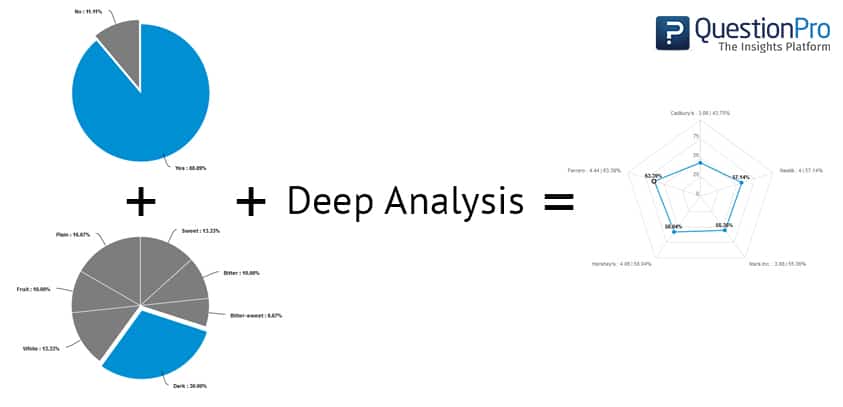
But now go a bit deeper and ask them what type of chocolate they like – the percentage of chocolate, bitter or sweet or bitter-sweet, white or dark, with fruit filling or just solid bars, flavoured or plain chocolate? Then using your survey software, get a pie chart analysis.
Looks pretty easy to understand even now right?
Now take it a notch further – Ask for same responses but for 5 different chocolate brands.
Now things just got a lot more complicated. In order to analyse each brand, you need 5 pie charts to understand consumer taste and preference.
But what would be even tougher is when you want to understand which type of chocolates consumers across all 5 brands lean as an average. This will help you understand the “most common” preferred taste among all consumers across all 5 brands. As valuable as this insight may be, accomplishing this manually will need you invest incredible amount of time and patience and will require some pretty good math and geometry skills.
But thankfully, in such cases there is another method that achieves the same goal of graphical data representation in a much more visually appealing, clean and efficient way. We are talking about Spider Charts and how they can truly transform the way you get insights from your online surveys.
In one of our latest updates, we have brought the convenience of automated Spider Charts to our online survey platform, enabling users to conveniently view analysis reports of multi-variate survey questions. This type of Charts give an instant and effortless view of the average of all entities and their variable attributes where it uses the variables and “plots” the “mean” of all the results to give you a birds-eye view of the survey result.
Sounds interesting? Give it a try now!


